A Paper Series Post
Creating a bulletin board filled with photographs of spring baskets, bird eggs, and wreaths is an inexpensive way to enjoy photographs from magazines, brochures, catalogs, flyers, maps . . . Plus, seeing collected clippings on a board gives ideas for creating similar arrangements around the house. Take a look at the latest bulletin board arrangement in my house for March, and read my suggestions for creating your own bulletin board arrangements.
Last fall I rejuvenated an old ordinary bulletin board by painting the cork board ink blue and by applying a gold gel stain to the narrow wooden frame. When I shared the finished look in a post, I promised readers a new series of Bulletin Board Inspiration. Today is the first of several bulletin board inspiration posts, with tutorials included for how I lay out my bulletin boards. The board I created and photographed last November will debut this November.
B U L L E T I N B O A R D I N S P I R A T I O N
Baskets, Eggs, Wreaths
s u g g e s t i o n # 1
"White Space"
White Space is area left open, not used, on pages, on walls, in landscaping, in room arrangements . . .
Minimalists purposely use LARGE white space as part of their designs, but white space is used in any style, not just minimalist style. The collection of baskets, eggs, and wreaths on this board is not minimalist in style, but the arrangement uses white space by leaving open areas between the photographs.
Why use white space in bulletin board arrangements? Two reasons, which are completely interconnected.
① Each item is viewed on its own not just as part of the whole.
Some bulletin board arrangements fill every square inch of surface on the board, but such an arrangement is for the board's creator alone, not for others. Filled bulletin boards can be overwhelming without giving a viewer a chance to see individual items or to see a theme in collected photographs.
② White space gives the viewer's eyes and mind places to rest.
White space allows the viewer to comprehend the items on the board, without becoming overcome with too many objects to process at the same time. White space offers order, calm, and processing time.
s u g g e s t i o n # 2
Layering
Totally disconnected pages can look uninteresting. Instead of tacking pages up separately, overlap the edges of one page with edges from other pages. With practice, you can develop a sense of how much of one page to cover with a nearby page.
① A practical purpose of layering is to hide an unwanted part of another photo.
The page with the horizontal hanging bird nest has the top right corner cut out. I don't remember why I cut out the page with a missing corner, but there may have been a small non-related photo in the corner that I did not like. Or, there could have been a written paragraph. By placing the center page with eggs so its corner fits the cut out section exactly, no one knows about the cut out corner.
② Visually connecting the photos with one another creates a design that links the items into one overall design.
Layering corners of photographs leads the viewers eyes from one photo to another, keeping the eyes inside the design, and not leading the eyes beyond the design with no visual connection to other parts of the arrangement. Whether designing a three dimensional vignette on the top of a chest or designing a flat bulletin board design, one major design element is to layer the items so they connect with each other.
③ Layering saves on the number of tacks needed to hang the pages on the board.
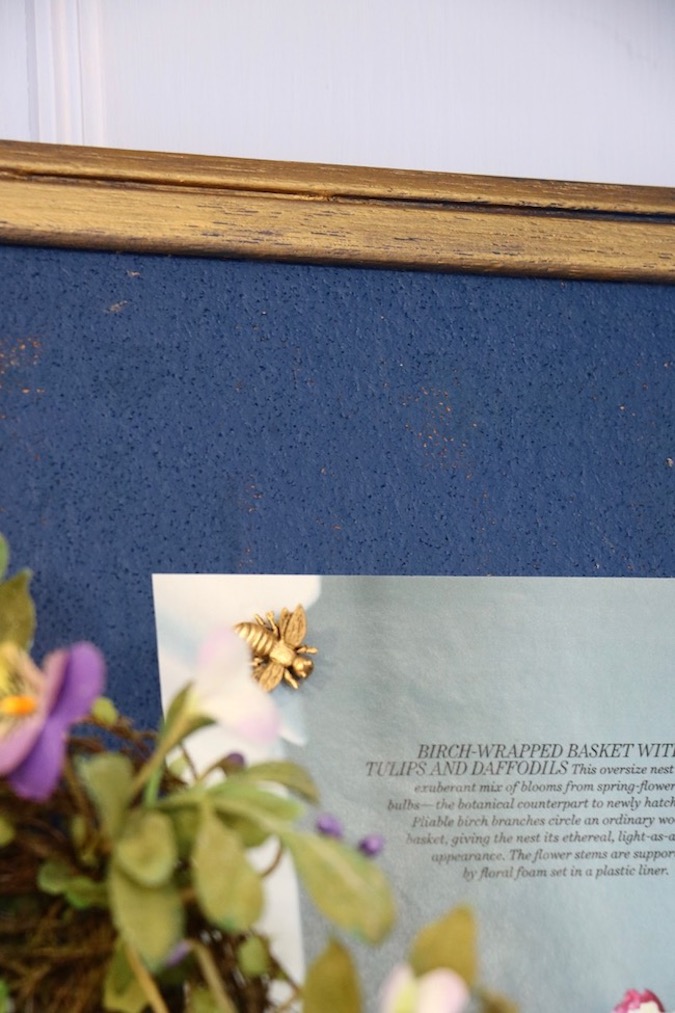
The bottom picture of the pink and yellow tulips and hyacinths has only two bee tacks at its top corners. And, those two bees are holding the bottoms in place of the two photos above. The horizontal hanging bird's nest has only one other Eiffel tower tack at the top left, and the photo of the wreath nest with blue candy eggs also has only one other fleur de lis tack at its top center. The center egg photo has only two tacks holding it in place at its upper left side (bee tack) and top right corner (Eiffel tower) which in turn, hold the two photos above the egg photo in place.
s u g g e s t i o n # 3
Tacks
Use beautiful tacks to attach pictures to a bulletin board.
Collect unusual tacks to enhance the beauty of the bulletin board photos. Gold bees, Eiffel towers, and fleur de lis decorative tacks are beautiful by themselves, and add beauty to the pages they hold in place. In addition, their gold color coordinates with the gold frame.
② Collect tacks that can hold three-dimensional items in place. Objects can hang by ribbon or twine from the Eiffel tower tack. Or, the top of the tower can hold objects in place by sliding the tower under or into the object, like the three-dimensional bird's nest on this bulletin board.
s u g g e s t i o n # 4
3-D Objects
Add interest to bulletin board displays by including three dimensional objects.
① Three dimensional objects add texture to flat image displays.
Another key element to any design is to use texture. The bird's nest adds texture with its twiggy composition and with the colorful floral garland around its outer rim. The pale blue ceramic bird's egg adds yet another texture to the display.
② Three dimensional objects create focal points.
Another basic design element is a focal point. Landscape and architectural paintings are prime examples of how effective focal points are in design. But, vignettes that capture our attention also have focal points.
s u g g e s t i o n # 5
Vary Image Sizes
Use small, medium, and large photos interspersed on the board.
① Don't hesitate to use small photos.
Placing them layered on larger images is similar to magazines inserting small photos onto larger, full-page images.
② Uniform framed photos are quite striking in gallery displays, but varying page sizes on a bulletin board is another way to create an unexpected element that adds ZING to a design.
③ Medium and small photos draw viewers closer to the board.
s u g g e s t i o n # 6
Color
Color design is almost endless and fills books and books. Here are the color principles I see in grouping these images together.
① Colors are mostly coordinated by intensity. Pastels with a few more intense colors create harmony in the images.
② Colors are repeated across the images.
Pinks and yellows are in the top right and bottom center photos and their placements balance those colors across the board.
Yellow is repeated in photo of the eggs on the white pedestals and the walls behind the floral arrangement in the bottom photo.
Bright spring green is in the backgrounds of both the horizontal hanging bird's nest and the wreath nest holding the blue candy eggs.
Neutrals are repeated in the two large egg display photos.
③ The small photo of the yellow eggs is not lost on the bulletin board.
One way to draw attention to a small photo is to place the photo next to a larger photo in a contrasting color. The small photo of two pedestals filled with yellow eggs contrasts with the ink blue of the cork board and of the background blue in the photo above it.
s u g g e s t i o n # 7
Text
Include text in some of the photos.
① Text helps you remember directions about how to recreate similar items.
② Text identifies objects in the photograph. Without the accompanying text, this set of numbers in the photograph becomes meaningless.
While "the good egg GUIDE" is not the title of my bulletin board display, it could be the title of a board in which all of the photographs are about eggs. Or, a photograph with a month's name could be the title of a board all about what's happening in that month.
s u g g e s t i o n # 8
Image sources
Before you toss out any magazine, catalog, brochure, advertising flyer, tourist information, paper napkin, paper placemat, map, etc... clip out photographs you enjoy. Save them in a file box for future uses, including bulletin boards.
① Country Living, British Edition - magazine
② ③ ④ ⑤ ⑧ Martha Stewart - magazines, not all the same issue
⑥ Better Homes and Gardens - magazine
⑦ Williams and Sonoma - catalog
~~~~❦~~~~
I hope you enjoyed seeing my latest bulletin board's photos for Spring and Easter inspiration during March. Soon I will change the board to enjoy more photos collected for years on a variety of ideas for decor, gardening, projects, Christmas, food, changing seasons, etc...
Don't miss the latest French-inspired project, garden tip, decorating idea, or holiday inspiration. Get every new blog post delivered to your email inbox. Sign up in the blue box at the top right of the sidebar.
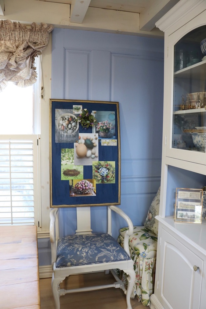
I am still looking for a good place to display my bulletin board. One place I am considering is on the paneled wood wall in the dining area of the living room. The location is good for seeing my latest bulletin board filled with inspiring beautiful pictures and would remind me to change the board.
To keep from damaging the handmade wood paneling, the bulletin board would have to hang by a ribbon from the white beam at the top of the wall. The dark blue of the cork coordinates nicely with the French blue paneling.


